In web design, it’s important to create for the viewer. When putting together a website, you always want to be thinking about how your site users will be reading your content, how they will be navigating the pages, and how the experience of your site will affect them. An often overlooked and seemingly simple way to engage people on your website is by utilizing typography and the variety of ways in which it can be manipulated. Typography allows you to be communicative and to reflect your brand and your brand’s personality all at once. However, there are definite restrictions to the extent that one can use typography effectively.
The Do’s of Web Design Typography
Do read your content. Read the text with the typography you’ve originally chosen and work from there. Is it easy-to-read? Does it fit whatever it is you are explaining? Is it cohesive with your brand? If these questions receive positive feedback, you may continue on. Be sure to put yourself in the mindset of your viewers when reviewing your text.
Do use sans-serif fonts. For body texts especially, a sans-serif font reads much easier on a screen–whereas serif fonts are more beneficial for readers offline. Sans-serif fonts were essentially designed for web use, so utilize this typography for your site content. For your logo and your homepage, and for pieces of text that are essentially just larger than the rest, this is less important. However, body texts and large chunks of type should be in a sans-serif font.
Do get creative! While readability is of the utmost importance, you don’t want your readers falling asleep. Don’t be afraid to get creative on your homepage or with title text.
The Don’t’s of Houston Web Design Typography
Don’t choose a serif font for webpages. Serif fonts are meant to be read in print and can be difficult for readers to scan and pull information from. Serif fonts include letters that have less space between them and which have “tail-ends.” Examples of serif fonts are Times New Roman, Baskerville, and Cambria.
Don’t disregard your viewers for your own personal design choices. If you want to use typography to grow your business and web presence, you have to be considerate of how your site users will respond to what they see. It’s important to review your site as if you were a potential customer, and design accordingly.
Don’t be afraid to take risks. While it’s important to be considerate of viewers, you also want to excite and entice them. You want to stand out from the crowd, so be bold in your typeface choices. Use title texts as a way to throw caution to the wind, and really be audacious.
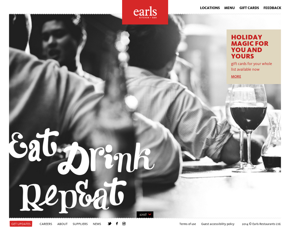
https://www.earls.ca
Earl’s uses similar unconventional cursive in their title text, which is left-aligned. The viewer’s eye is immediately drawn to that side of the page, but then easily floats around to discover body text in a bold sans font.
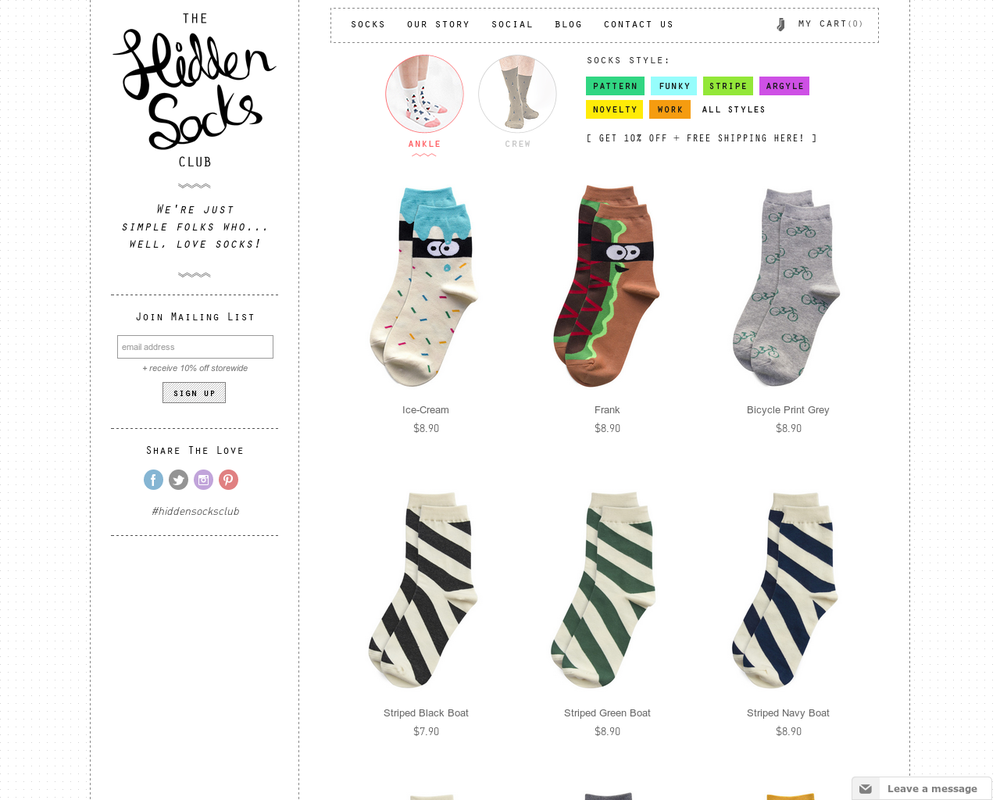
http://hiddensocksclub.com.au
Hidden Socks uses handwritten font for their title and subtitles, which is another big trend in web design typography. This is an excellent use of personal creativity reflected in one’s branding and it really gives viewers a solid impression of the company.
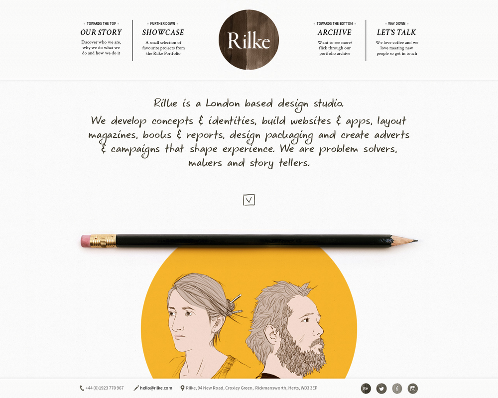
www.rilke.com
Rilke Design Studio created a homepage that looks as if it was all drawn (professionally) by hand. This gives the viewer the impression that these designers are hands-on, creative, and willing to implement these skills into the work they do for their clients. This is a perfect example of daring typography done correctly.
Need Some More Web Design Advice?
Call our Houston web design and internet marketing expert at 1-800-440-6190 or fill out our contact form.