While you probably know that you need a responsively designed website to keep and engage users on your website when they use their mobile and tablet devices, you may not know that this same adaptable website can boost your search engine optimization (SEO) as well!
And if your business is in a competitive industry, this could be the edge you need to bump up your mobile search engine rankings.
Below we look at 10 SEO benefits of responsive web design and how they can impact your visibility in the mobile search results.

10 SEO Benefits of Responsive Web Design
1. One Website for All Devices
Responsively designed websites adapt to the screen size and resolution of the device used to display a site. This means that ONE website is adapting to the needs of users.
With one website able to show on all devices, Google can easily crawl, index, and organize your content. It doesn’t have to crawl a separate mobile website or index different versions of the same content. (And as we describe later, this also minimizes the possibility of duplicate content.)
Bonus: Not only is this a benefit for SEO, but a HUGE benefit for you. You can update one website with new content, images, landing pages, etc. and it will refresh across the mobile, tablet, and desktop versions of your site.
2. Improves Mobile Search Rankings
Over the past two years, Google has made significant changes in how they rank mobile-friendly websites. In April 2015, Google released the “use of mobile-friendliness as a ranking signal.” This change affected mobile searches worldwide and significantly impacted mobile rankings.
And in March earlier this year, they further updated the ranking signal to help users find even more relevant and mobile-friendly content.
These updates, and those to come in 2017, only reinforce the impact a mobile-friendly website has on your mobile search rankings. And with mobile and tablet searches continuing to climb, it’s critical that you adapt to maintain and increase your mobile visibility.
3. Reduces Page Load Speed on Mobile Devices
When visitors are searching on-the-go, they’re looking for fast answers to their query. They don’t have time nor do they want to wait for your website to load. They will quickly leave and find their answer somewhere else, and will be less likely to return in the future because of their poor user experience.
Responsive web design reduces the amount of time it takes for your pages to load on mobile devices. Google isn’t redirecting to a mobile-specific website or trying to condense large files to fit tiny screens, resulting in quick load speed.
Google has said that the recommended page load speed for mobile devices is one second. See how long your current website takes to load with the PageSpeed Insights tool.
4. Reduces Bounce Rate
Google looks at bounce rate to determine if a website is providing quality content and/or user experience to it’s visitors. This is especially important when it comes to mobile searches as almost 60% of all searches are performed on a mobile device.
A responsive website reduces bounce rate because your website will automatically offer the best user experience to your visitor, keeping them engaged and on-site longer.
5. Improves User Experience
User experience plays a huge role in SEO. As soon as a visitor hits your website, their ability to find/get what they’re looking for is measured. And if your site isn’t mobile-friendly, your poor user experience will frustrate visitors, forcing them to leave and go elsewhere.
Responsive web design significantly improves your visitor’s user experience. From the moment they land on either your homepage or service landing page, you’re making it easier for them to spend more time on your site and view more pages.
6. Is Cost-Effective
Think about it like this: is the cost of maintaining one website cheaper or more expensive than maintaining multiple websites?
The answer is undoubtedly cheaper.
You’re only paying for one domain, one URL to be hosted, and one site to be updated.
While these are just the basic costs of owning a website, these figures alone show you the cost-effectiveness of responsive web design.
7. Improves Backlink Profile
Your backlink profile consists of all the websites that link back to yours. When authoritative websites point to your domain, it shows Google that you’re providing value to others. This can positively impact your search engine ranking.
Responsive web design improves your backlink profile because you’re building links to one domain, not splitting your time building up two domains. It also makes it easier for other websites to link to you, as they are not having to guess which URL is right.
It also keeps your local listings consistent, with the same name, address, phone number, and URL shown across the web.
(Note: Your link building mentality should be less is more. You should focus on authoritative, quality links that will show long term results versus so-so links for a short term boost.)
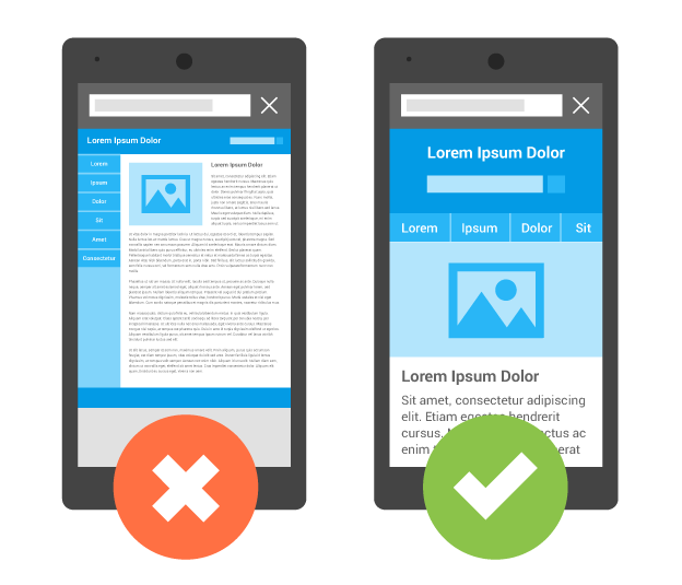
8. Minimizes Potential Duplicate Content Issues
If you have multiple websites for multiple devices, you’re essentially creating duplicate versions of your content. This can and will wreak havoc on your SEO as Google may think you’re trying to skew the search results.
With responsive web design using one website to house your mobile, tablet, and desktop versions, your content is all in one super convenient place. And it’s all original to your website, ready to be displayed to your visitors on whatever device they choose.
9. Increases Social Sharing
Everyone wants their content to go viral on social media. But you can’t expect visitors to share your content if they can’t read or watch it on their smartphones or tablets. 80% of social media time is spent on mobile devices, making responsive web design important to your social media success.
10. Cause Google Says So
Google has made it very clear that they prefer responsive web design.
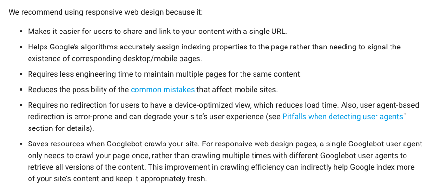
Google’s stance on responsive web design
And ultimately, because Google controls over 79.88% of the search engine market, their preferences should be incorporated into your digital marketing strategy in order to maintain and increase your visibility in the mobile search results.
Let Us Help You Build and Grow Your WordPress Website
At TheeHouston Agency, we are committed to helping our customers find success online! For us, that means developing a well-optimized and highly-converting website on WordPress, and continuing that success with a variety of digital and inbound marketing tactics. Our Houston web design and internet marketing professionals are here to help you! Give us a call at 281-764-9070 or fill out our contact form.

")